
Today, people use their smartphones for almost everything—from searching for businesses and comparing products to reading reviews, booking services, and making purchases. As more customers access the internet through mobile devices, businesses can no longer treat mobile compatibility as an optional feature.
Your website may look excellent on a desktop computer, but if it is difficult to use on a smartphone or tablet, you could be losing potential customers before they even have a chance to learn about your business.
This is where responsive web design becomes important.
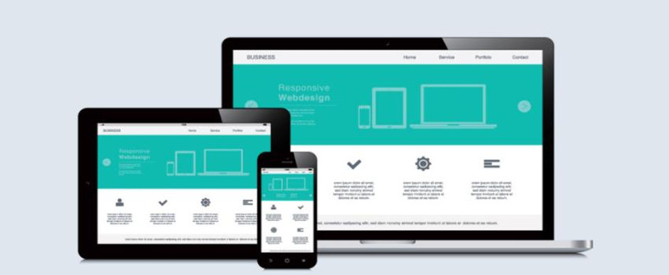
A responsive website automatically adjusts its layout, content, images, and functionality to fit different screen sizes and devices. Instead of creating separate experiences for desktop and mobile users, responsive design provides a consistent and user-friendly experience across devices.
But why does this matter so much for businesses?
From customer experience and engagement to SEO and conversions, responsive design can have a significant impact on how your website performs.
What Is Responsive Web Design?
Responsive web design is an approach to website development that allows a website to adapt to the device and screen size being used.
Whether someone visits your website from a desktop computer, laptop, tablet, or smartphone, the website should adjust accordingly.
For example, on a desktop, your website may display several navigation options across the top of the page. On a smartphone, the same navigation may appear through a compact menu. Images may automatically resize, text may adjust to fit the screen, and columns may stack vertically to make content easier to read.
The goal is simple: make the website easy to use regardless of the device.
A responsive website should allow visitors to:
- Read content without zooming in
- Navigate pages easily
- Click buttons without difficulty
- Complete forms comfortably
- View images correctly
- Access important information quickly
- Interact with the website without unnecessary scrolling or resizing
Responsive design is therefore not just about making a website “fit” on a smaller screen. It is about creating a complete user experience that works effectively across different devices.
1. More Customers Are Browsing on Mobile Devices
One of the biggest reasons businesses need mobile-friendly websites is the growing importance of mobile browsing.
People no longer wait until they are sitting at a computer to search for information. They use smartphones while commuting, shopping, travelling, sitting at home, or even while comparing businesses from a physical location.
A potential customer might search for a nearby service, visit a company’s website, check its offerings, and decide whether to make contact—all from a smartphone.
If the website is difficult to use on that device, the customer may leave and choose another business.
This makes mobile responsiveness an important part of the customer journey.
A business website should be prepared for visitors regardless of how they arrive. Providing a smooth mobile experience means customers can interact with your business whenever and wherever they choose.
2. Responsive Design Improves User Experience
User experience is one of the most important aspects of a successful website.
A visitor should not have to pinch and zoom, rotate their phone repeatedly, scroll from side to side, or struggle to find the menu just to understand what a business offers.
Unfortunately, these problems are still common on websites that were designed primarily for desktop computers.
Imagine visiting a website on your smartphone and finding that the text is too small to read. You try to zoom in, but now you have to move the screen from left to right just to read a sentence. Then you discover that the contact button is difficult to tap.
Even if the business offers exactly what you need, you may decide that finding another provider is easier.
Responsive web design eliminates many of these frustrations by adapting the website to the visitor’s screen. A good mobile experience should feel natural. Visitors should be able to navigate, read, and interact with your website without thinking about the technology behind it.
3. Mobile-Friendly Websites Can Increase Engagement
When visitors have a positive experience, they are more likely to explore a website.
They may visit multiple pages, read your services, view your portfolio, learn about your company, or look for contact information.
On the other hand, a poor mobile experience can cause visitors to leave almost immediately.
Responsive design helps reduce these barriers by making your content accessible and easier to navigate. For example, a responsive service page can automatically adjust its layout so that headings, text, images, and buttons appear in a logical order on a smartphone.
Instead of presenting visitors with a desktop layout squeezed onto a small screen, the website reorganizes the content to make it easier to consume.
This can encourage visitors to spend more time engaging with your website and learning about your business.
4. Responsive Design Can Support Better Conversions
The ultimate goal of many business websites is not simply to attract visitors. It is to encourage them to take action.
Depending on the business, that action could be:
- Requesting a quote
- Filling out a contact form
- Booking an appointment
- Calling the business
- Purchasing a product
- Signing up for a service
- Downloading information
- Starting a consultation
If these actions are difficult to complete on a smartphone, potential customers may abandon the process.
For example, a customer may be ready to request a quote but find that the enquiry form does not display properly on their phone. Another visitor may want to call a business but struggle to find the contact information.
Responsive design helps ensure that important calls to action remain accessible across devices.
Buttons should be easy to identify and tap. Forms should fit the screen. Navigation should be simple. Important information should not be hidden behind difficult menus. Every small improvement can make it easier for visitors to move from browsing to taking action.
5. Mobile Responsiveness Can Support SEO
Responsive web design is also important for search engine optimization.
Search engines aim to provide users with useful and accessible results. Since many people access websites through mobile devices, mobile usability has become an important part of the overall website experience.
A website that provides a poor mobile experience may struggle to perform as effectively as one that is optimized for different devices.
Responsive design can also make website management easier from an SEO perspective.
Instead of maintaining separate desktop and mobile versions of a website, businesses can use one responsive website with the same core content and URLs.
This creates a more consistent experience for both users and search engines.
However, responsive design alone does not guarantee higher search rankings. SEO also depends on factors such as content quality, technical performance, keywords, website structure, backlinks, search intent, and page experience.
Responsive design should therefore be considered one important part of a broader SEO strategy.
6. Responsive Websites Improve Brand Credibility
Your website can influence how customers perceive your business.
A modern, well-designed, responsive website can create a stronger impression of professionalism and reliability.
On the other hand, a website that looks broken or difficult to use on mobile devices can make a business appear outdated—even if the company itself is professional and successful.
Think about the impression a customer gets when every element of a website works smoothly on their phone.
- The content is easy to read.
- The images display correctly.
- The menu is simple.
- The buttons are easy to tap.
- The contact information is easy to find.
- These details communicate that the business cares about its customers’ experience.
A mobile-friendly website therefore contributes not only to usability but also to the overall perception of your brand.
7. Responsive Design Creates a Consistent Brand Experience
Businesses often invest significant time in developing their visual identity.
Logo, colors, typography, images, messaging, and layouts all contribute to brand recognition.
But if your website looks completely different depending on the device, the consistency of your brand can suffer.
Responsive design helps maintain the same overall visual identity across screens while allowing the layout to adapt appropriately.
Your desktop website may have a wide layout with multiple columns, while the mobile version may use a single-column design. However, the branding, messaging, colors, imagery, and overall style can remain consistent.
This creates a more cohesive experience for customers.
Whether they discover your business on a laptop at work or on a smartphone at home, they should feel like they are interacting with the same company.
8. Responsive Design Can Improve Website Accessibility
A responsive website can also make information easier to access for a wider range of users.
Content should be readable without excessive zooming. Buttons should be appropriately sized. Navigation should be clear, and important information should remain accessible regardless of screen size.
Accessibility is not only about supporting people with disabilities. It is also about making digital content easier for everyone to use.
A website that is easy to read and navigate provides a better experience for customers across different devices, screen sizes, and browsing conditions.
This can be particularly important for businesses that want their websites to reach a broad audience.
9. Responsive Design Helps Businesses Adapt to New Devices
Technology continues to change.
New smartphones, tablets, laptops, monitors, and other connected devices are introduced regularly. Designing a website specifically for one screen size can create problems as technology evolves.
Responsive design provides greater flexibility because the website is built to adapt rather than remain fixed to a particular screen dimension.
This makes responsive websites more practical for long-term use.
Instead of redesigning the entire website every time a new device becomes popular, businesses can make improvements within a flexible framework.
What Happens If Your Website Isn’t Mobile-Friendly?
A website that isn’t optimized for mobile devices can create several problems.
Visitors may struggle to read your content, navigate between pages, or complete forms. Images may appear incorrectly, buttons may be difficult to tap, and important information may be hidden.
These problems can lead to:
- Higher visitor drop-off
- Lower engagement
- Fewer enquiries
- Reduced conversions
- Poorer customer experience
- Weaker brand perception
- Missed business opportunities
The impact may be particularly noticeable if a significant portion of your website traffic comes from mobile devices.
If mobile visitors are leaving quickly or rarely completing desired actions, it may be worth reviewing how your website performs on different devices.
How to Know If Your Website Is Truly Mobile-Friendly
Simply opening your website on your phone and seeing that it loads does not necessarily mean it provides a good mobile experience.
Consider the following questions:
- Is the text easy to read without zooming?
- Can visitors navigate the menu easily?
- Are buttons large enough to tap comfortably?
- Do images fit the screen correctly?
- Are forms easy to complete?
- Does the website load quickly?
- Are important calls to action easy to find?
- Does the layout remain organized on different screen sizes?
- Can visitors quickly find contact information?
- Does the website provide the same professional experience as the desktop version?
If the answer to several of these questions is no, your website may need improvements.
Responsive Design and Website Speed Work Together
Responsive design and website speed should not be treated as completely separate issues.
A website can technically be responsive while still providing a poor experience if it takes too long to load.
Mobile users may be browsing on different internet connections, and large images, videos, unnecessary scripts, and complex website elements can affect performance.
That is why an effective mobile-friendly website should focus on both responsiveness and performance.
Optimized images, efficient code, appropriate layouts, reliable hosting, and fewer unnecessary elements can all contribute to a smoother mobile experience.
The goal is not simply to make the website fit the screen. It should also be fast enough and efficient enough for users to interact with it comfortably.
When Should You Consider a Responsive Website Redesign?
If your existing website was built several years ago, it may be worth reviewing whether it still meets current mobile expectations.
A redesign may be worth considering if:
- Your website is difficult to use on smartphones
- Text and images do not adjust correctly
- Your navigation is confusing on mobile
- Contact forms are difficult to complete
- Your website loads slowly
- Visitors leave quickly from mobile pages
- Your website generates fewer mobile enquiries
- Your design looks outdated
- Your competitors provide a better mobile experience
Not every problem requires a complete redesign. Sometimes, specific technical or design improvements may be enough.
However, when several issues exist at the same time, a broader website redesign may provide a better long-term solution.
Conclusion
A mobile-friendly website is no longer simply a nice feature to have. It is an important part of creating a successful online presence.
Customers expect websites to work smoothly across smartphones, tablets, laptops, and desktop computers. If your website is difficult to navigate or interact with on mobile devices, you may be creating unnecessary barriers between your business and potential customers.
Responsive web design helps remove those barriers by allowing your website to adapt to different screen sizes while maintaining a consistent and professional experience.
From improving usability and engagement to supporting conversions, brand credibility, accessibility, and SEO, responsive design can play an important role in the performance of a modern business website.
Your customers are already using mobile devices to discover and interact with businesses. Your website should be ready to meet them there. At SeeSam Solutions, we understand that a successful website needs to look good, work smoothly, and provide a consistent experience across devices. A responsive, user-friendly website can help businesses create stronger digital experiences and make it easier for visitors to become customer.